Products
X


T-Shirts
Hoodies
Sweatshirts
Polos
Tank Tops
Accessories
Shorts & Pants
Caps
14 Tips for Effective Logo Design
As the saying goes: A picture's worth a thousand words.
If this were written in the modern age... they might have mentioned logos.
The McDonald's golden arches, the Nike swoosh, the Starbucks siren, the Coca-Cola signature script - When we think about a company, chances are their logo comes to mind.
A logo is a first impression and, ideally, a lasting one. It’s a simplified design that hopes to express a lot: to represent a company’s identity and ethos, to reflect its branding to customers and to be readily recognizable, differentiating its products in a sea of other options.
Your logo should speak for your brand, but what to say and how to say it can be a bit intimidating. We talked to designers, artists and Rochester businesses about what makes a good design - and how to craft a killer logo of your own.
1. Communicate your (unique!) message
A good logo is a logo that captures the identity of a brand. In that way, there's really no one thing a logo needs to be other than communicative. I don't think a logo has to be beautiful, clean, or cutting edge to be good. The old Google logos for example, which were a serif font in vibrant primary colors, and for years were accented by terrible beveling and dropshadow. An ugly logo for sure, but one that so perfectly captured the aesthetic of Google's roots-- that of nerds in a garage excited about the new digital playground of the internet.
- Courtney Brown, Creative Lead at TGW
2. Less is more
In most aspects of design, I tend towards minimalism, and logos are no different. I'd say a good logo is a thought boiled down to its simplest expression. As in what are the fewest components I need to convey this idea. A good logo feels like a natural extension of a brand’s personality; is memorable yet simple, and can work on a range of scales... from business card to billboard.
- Nathan Linkous, Designer and Creative Director
3. Tell your story
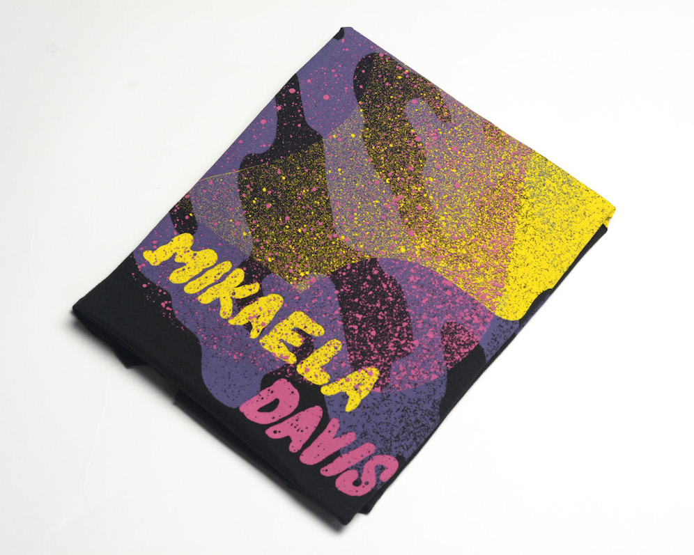
Profile: Rory Van Grol of Ugly Duck Coffee
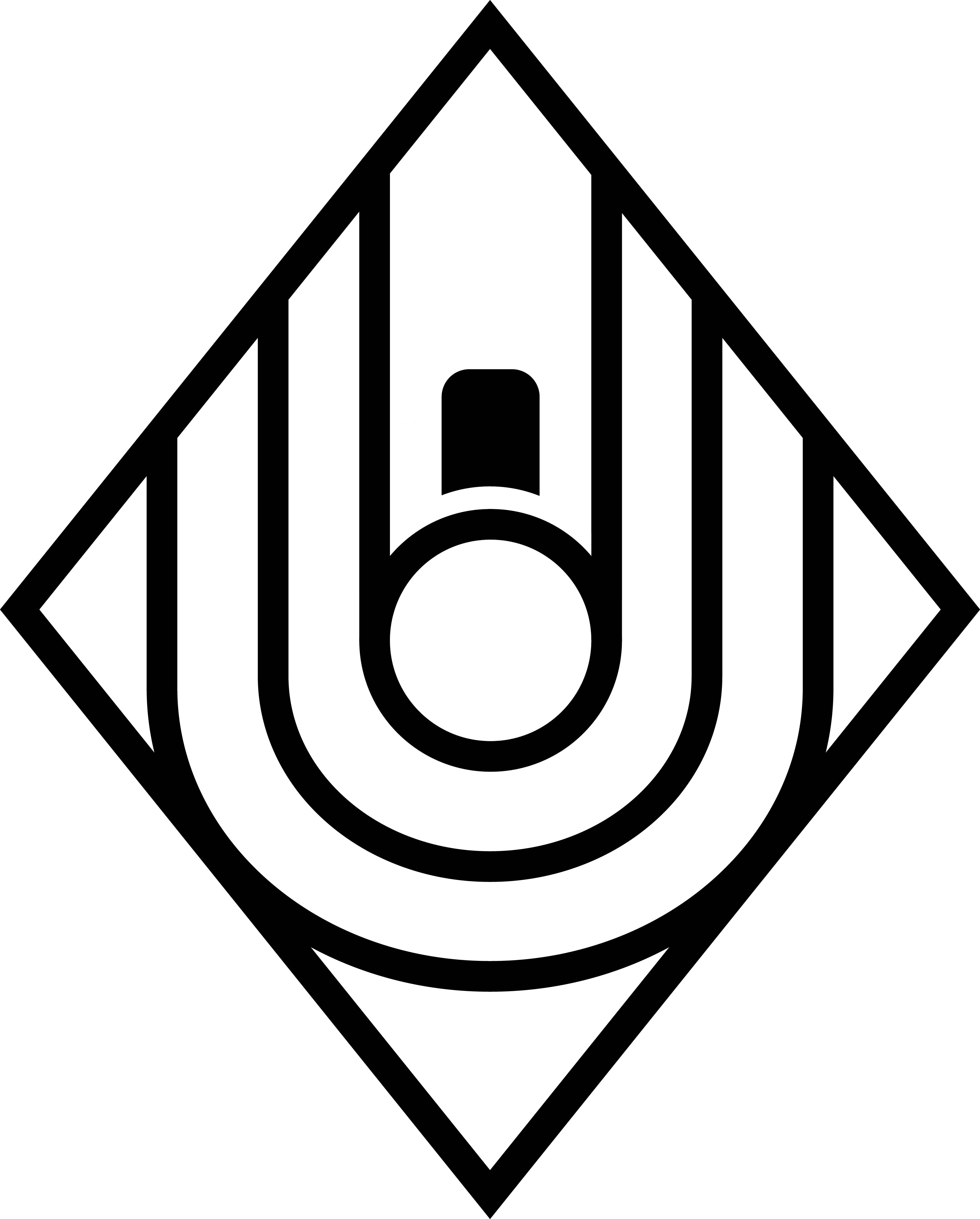
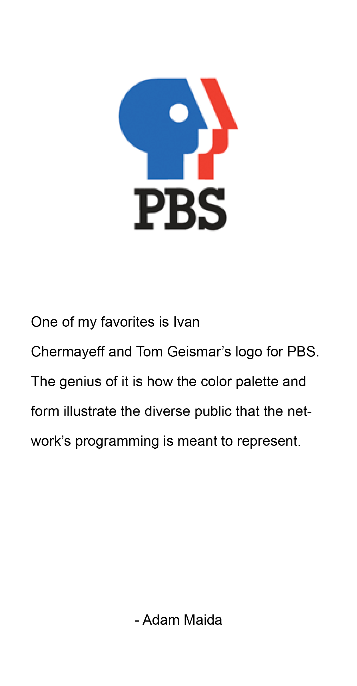
Before we even had a name for the Coffee Shop I knew that I wanted to have a "mark", "logo", or "brand" that could stand on its own. The two biggest creative entities that guided this are Skateboarding and punk/hardcore music. I was influenced by recognizing logos and marks and knowing who or what something was based on that alone for so long. Those marks were always simple, but said a lot. The diamond shape was a reference to some leaded glass border we uncovered in the first cafe space that never came to fruition. The bold swoops reference the name and espresso. We worked with a local artist and graphic designer Adam Maida to make our vision come to life.
4. Create a logo that’s memorable
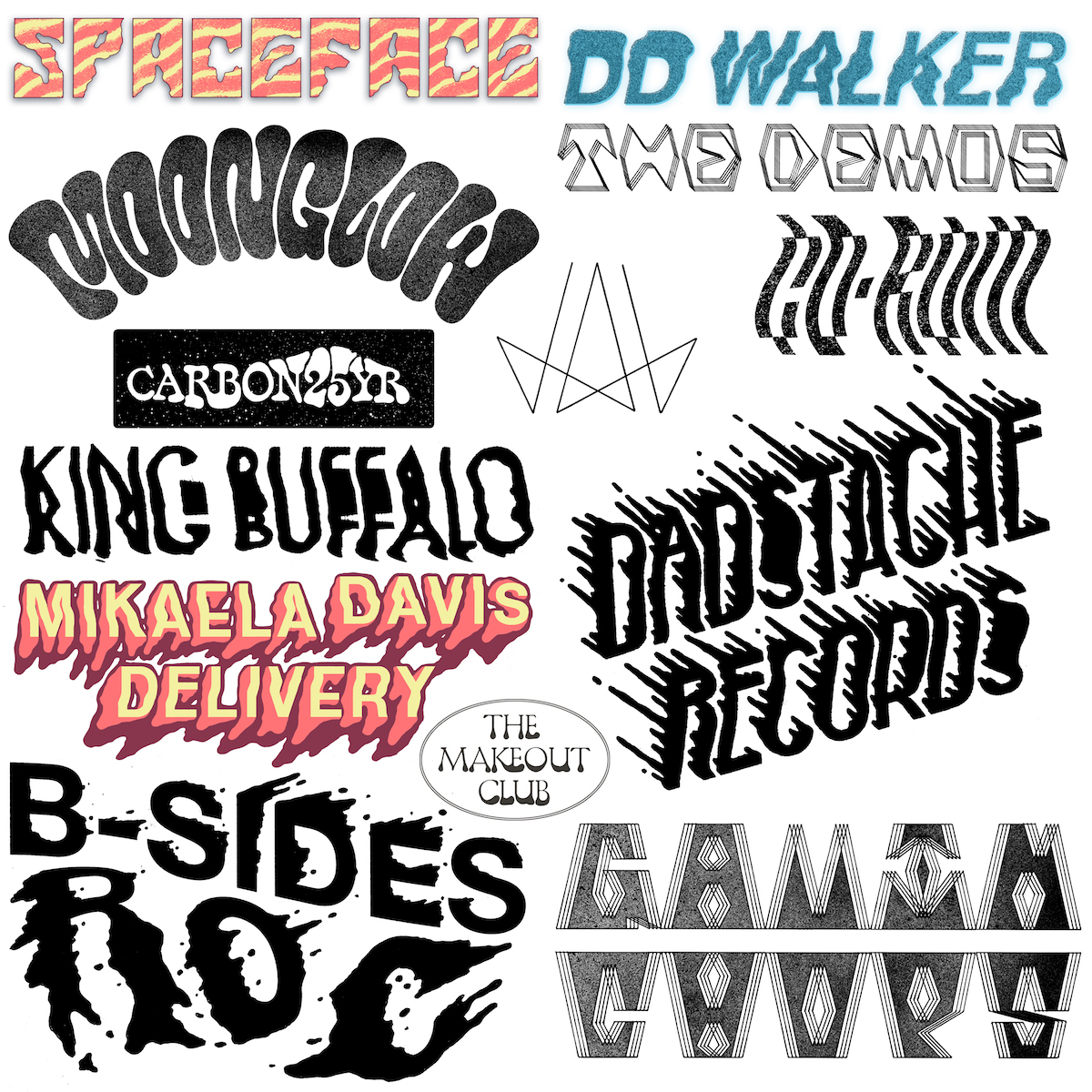
What makes a good logo? Its ability to be etched into the mind of the viewer: memorable, striking, absurd, complex, minimalist, whatever. But as long as it immediately burns and then remains smoldering in the subconscious. That’s when it’s objectively good.
- Adam Maida, Artist
5. Think big picture
Whenever I work on a branding project, I start with strategy. It's my job to get to know the intention behind the brand, what message it should convey, and to make sure I understand the big picture, and how the identity will be used from packaging to digital marketing. It starts by asking a lot of questions and having conversations about goals and values, and then I grab a pencil and start sketching!
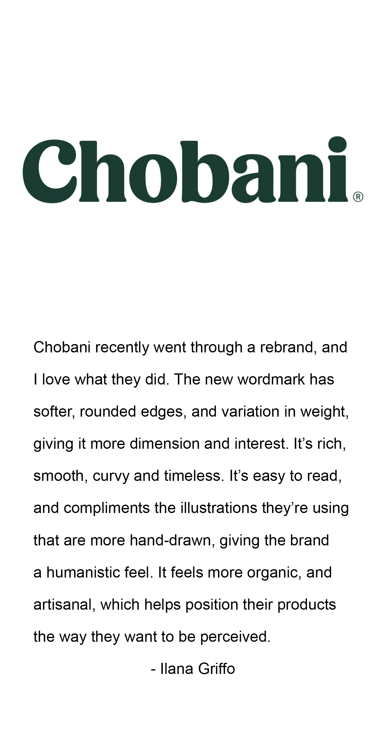
- Ilana Griffo, Designer and Illustrator
6. Get creative with typeface
Profile: Sarah Knight of Roc Girl Gang
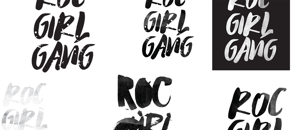
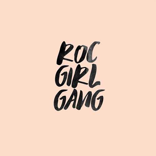
I’d say the story behind the logo— I sketched it out in the middle of the night on a big piece of scrap canvas. I always knew I wanted “Roc Girl Gang” which comes from Rochester (ROC) of course and part of the popular phrase: “Support Your Local Girl Gang”
Also on the canvas were words like: “social media platform”, “features, reposts & interviews”, “support, inspire, encourage” and “entrepreneurs, artists, creatives, movers & shakers”... all of these scattered words & ideas came together and created Roc Girl Gang.
I wanted the actual logo to look fun and easy breezy. And of course, include a poppy color like our millennial pink/blush which we are now known for. I was actually going to use my own handwriting or hire a letterer at first but found a typeface that I was able to use and it ended up looking much more fun/professional and that way I could use it again. I knew I wanted it to be attractive to my target market: Rochester's women. Sometimes I overthink a design but not this, it came together easy and I haven't gotten sick of it yet!
7. Design with your purpose in mind
Design is problem-solving really, so the first consideration is often what is the problem (or need) to be solved... what purpose will this design serve. Identifying the context and viewer is very helpful in the beginning. Good design is a marriage of Form and Function... a balance between the two. Once you know what problem you are solving, you work to do so in a way that is successful both in practical application and aesthetics.
- Nathan Linkous, Designer and Art Director
8. Consider proportion, shape and negative space
My all-time favorite logo is the Volcom logo. The strong triangular shape of it along with the inverted color scheme has always grabbed me. I recently discovered that its silhouette consists of a pentagon with an equilateral triangle placed on top of it.
- Jay Hewitt, Artist, Art Department at Tiny Fish Printing
9. A vector logo means versatility
Profile: Daniel Nothnagel of Three Heads Brewing
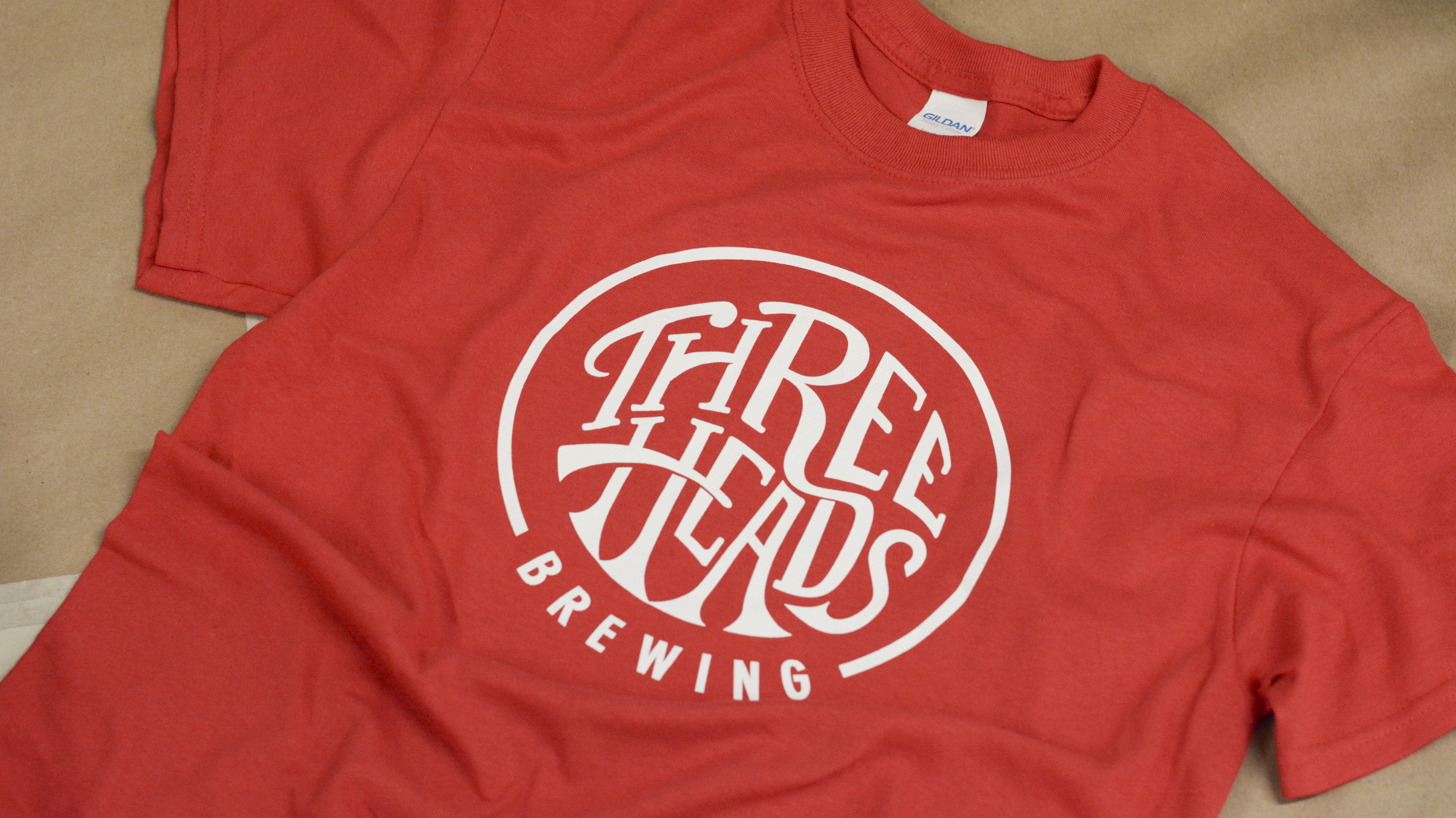
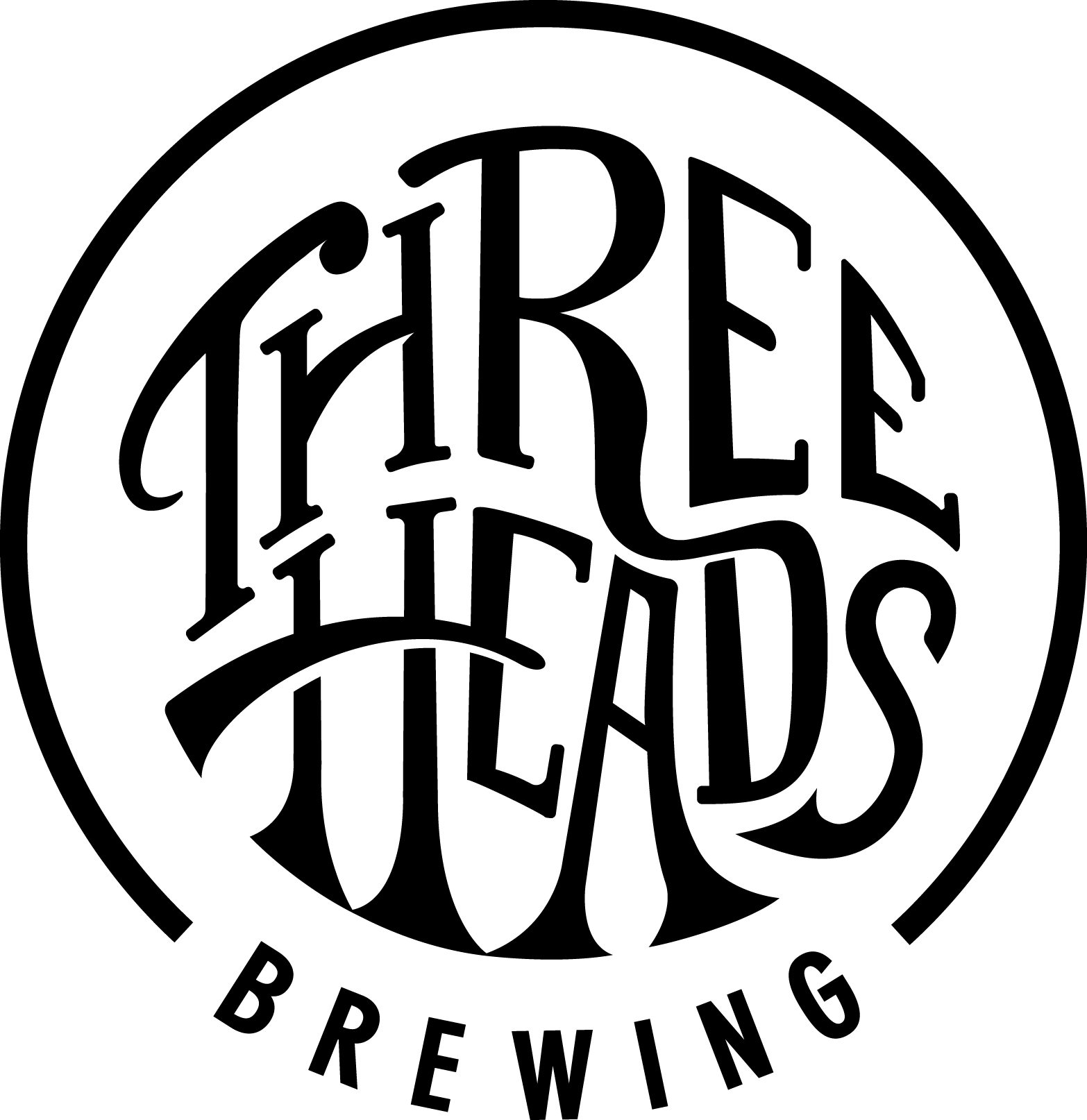
When we moved into our new facility, we wanted to update our logo to give greater representation to who we are and what we stand for. We also wanted our logo to be versatile - looking for a vector logo that could change color, backgrounds easily - not be married to specific color scheme, picture, background, etc. The result was fantastic! The work Grid Marketing did to capture these sentiments cannot be understated. We ended up with a 60's music poster vibe and are incredibly pleased.
Simplistically we are a brewery with a tasting room, but metaphysically we want to be a lifestyle brand that represents good times with good people, good music and good brews. But it isn't a result of some business case study or demographic report, we feel that with our logo and all of our branding, that we are authentic to ourselves and put ourselves on the outside, as well as on the inside, of all of our products.
10. Color is key
Consider what happens if you need to print your logo in one color. If your logo cannot be simplified into a black and white version without losing important forms, you may want to go back to the drawing board.
Our logomark at TGW is composed of very simple geometric shapes resembling a campfire. The simplicity of it allows it to be very adaptable-- it can be printed tiny or huge, made into a looping gif, drawn with a quick "^" and "x," or fabricated as a sweet neon sign while still being recognizable. Remember to think about how your logo will live on all sorts of surfaces, both digital and physical.
- Courtney Brown, Creative Lead at TGW
11. And scale, too.
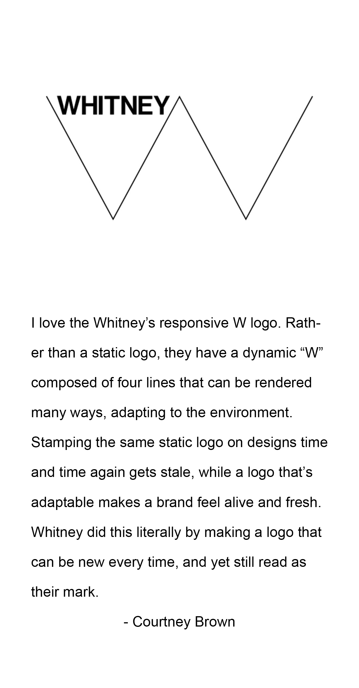
A logo design is so much more than a singular mark. Your visual brand should be a reflection of your business, and something that'll work with you as your business grows and evolves. Legibility is key. Scale is really important - you want to ensure that your system will work well large, and small, which often times means you'll have a primary and secondary logo for specific purposes.
- Ilana Griffo, Designer and Illustrator
12. A good logo is easily recognizable
Profile: Danielle Raymo of Rochester Brainery
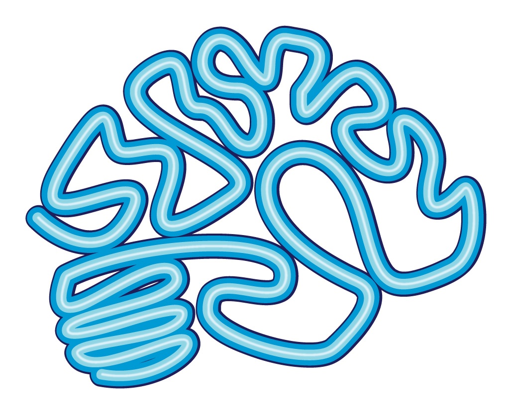
When we thought of the logo we knew a brain made the most sense... we are Rochester Brainery, after all. I had this thought for a glowing neon look- funky, fun, something that says "the learning is open for business." Ultimately, something that could stand as a unique symbol for our business people would (hopefully!) recognize on it's own.
13. Design with the future in mind
The design for the [Rochester Brainery] logo really started from Danielle’s vision of a neon brain. I wanted to add a unique touch to the shape of the brain, so I adjusted the lines that formed it, to slightly resemble the word “brainery”. It was definitely meant to be more of a hint of the word, since my main goal was for the brain to really sell as a neon sign.
After landing on the shape of the brain, I worked with Danielle on choosing the color and typeface.
When designing the lock up of the logo mark, I considered that this was a new business whose future was unknown. I wanted to give the logo a clean structure that could easily expand into a system of logos, if needed, as the company grew.
- Jessica Raymo, Designer
14. Go with your gut - and then don’t be afraid to change it up
What makes a logo is its ability to reflect what it’s representing. Which is a funny statement. Occasionally a client has a grand vision in mind that isn't always achievable. But more often the original concept is what you end up getting back to. I respect companies that change their logo around every few years. It's great to keep things consistent but change is always great.
- Mike Turzanski, Visual Artist
Design Analysis