Products
X


T-Shirts
Hoodies
Sweatshirts
Polos
Tank Tops
Accessories
Shorts & Pants
Caps
The ABCs of typography tees
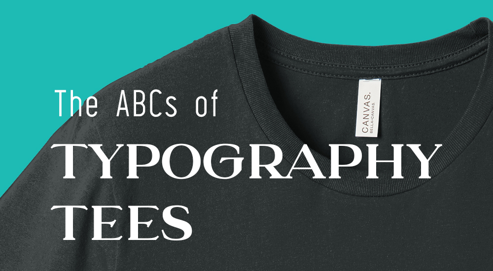
Powerful and memorable in their simplicity, typography tees are included among the most iconic designs in the history of printed apparel: I ♡ NY, RUN DMC, Frankie Say Relax, Vote for Pedro, Keep Calm and Carry On (and all it’s ongoing iterations).
Typography, when done well, can both effortless and impactive, creating a timeless tee. Done poorly, however, it can be awkward, clumsy - badly relaying your message and looking less-than awesome in the process.
Like all types of design, typography is governed by guidelines that help produce the best results. And while some of the very best ideas defy every convention, the following tips and considerations can help you get started.
Choose your fonts
Think about what mood or meaning you want your message to convey and feel out a font that matches. You can check out these font profiles to get . Each type of font says something a little different: Standard Serif and Sans Serif fonts will look more professional and sleek, Scripts will add a handmade feel that can go from formal to casual. Decorative fonts, which very greatly, can evoke a whole range of moods.
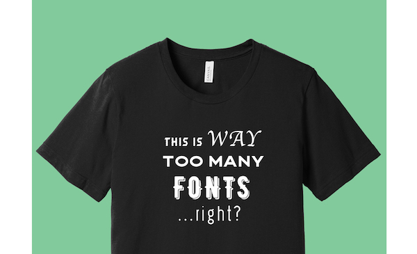
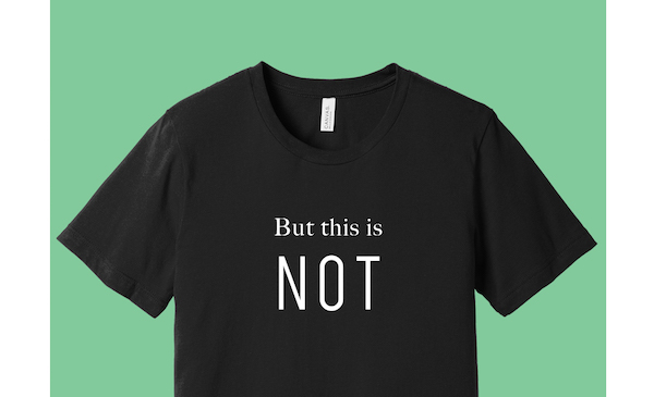
When it comes to choosing a font, readability is an important factor. Decorative fonts can be difficult to read in densely set text. If using one in a longer statement, try combining two different fonts: The decorative font will make important words stand out while a simpler font will prevent the rest of the text from becoming overwhelming.
Combining fonts can create more visual interest in any design. Just don’t use no more than two. Another good rule of thumb? Serif and Sans Serif fonts will generally go well together.
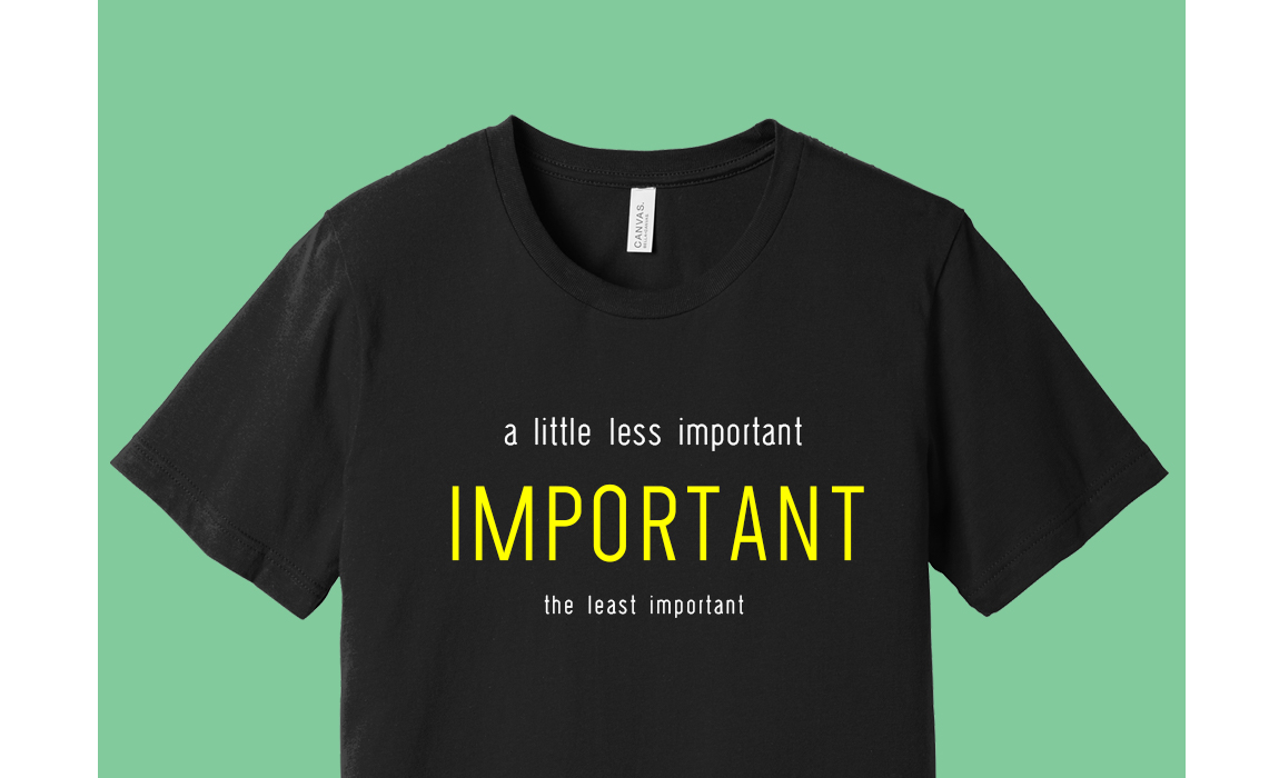
Create Visual Hierarchy
Not every word needs equal weight. Spacing, color, and size can place emphasis on words or phrases you want to highlight.
Contrast
Contrast is an important aspect of readability - and readability is an important aspect of effective typography. For your shirt to be legible, you’ll want to choose an ink color and apparel color that provide enough contrast.
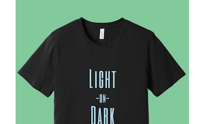
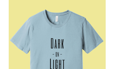
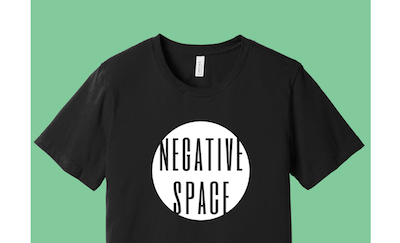
Of course, some rules are meant to be broken - especially when overall look, not readability, is the design’s main priority. Sleek black-on-black prints and the muted minimalism of monochromatic designs are two incredibly popular low contrast looks.
Sizing and placement
There are additional considerations with apparel typography that other mediums simply don’t have: Namely that, for most of the time, the text won't lie totally flat. It’s important, then, to consider how the design will be impacted when it molds to the shape of a body.
Sizing is espeically important. We suggest keeping the width of your design within 10” or 11” - anything over that and your design will begin to run into the folds caused by the armpits.
Try to think about your t-shirt as a page. Text that’s too small will seem awkward if it’s floating off by itself, while text that isn’t important wouldn’t make much sense as a headline.
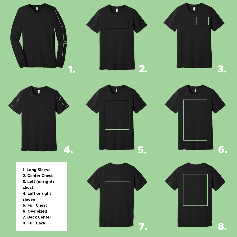
While there are many possibilities for typography placement (like overseam and over pocket) we’ve put together 8 conventional common print locations as a good starting point for placement. Your sales representative can help you select the best placement and size for your design.
Ready to get started? Check out nine of our favorite free fonts.

Don't miss out on a thing - Sign up for our newsletter to get our blogs right in your inbox.